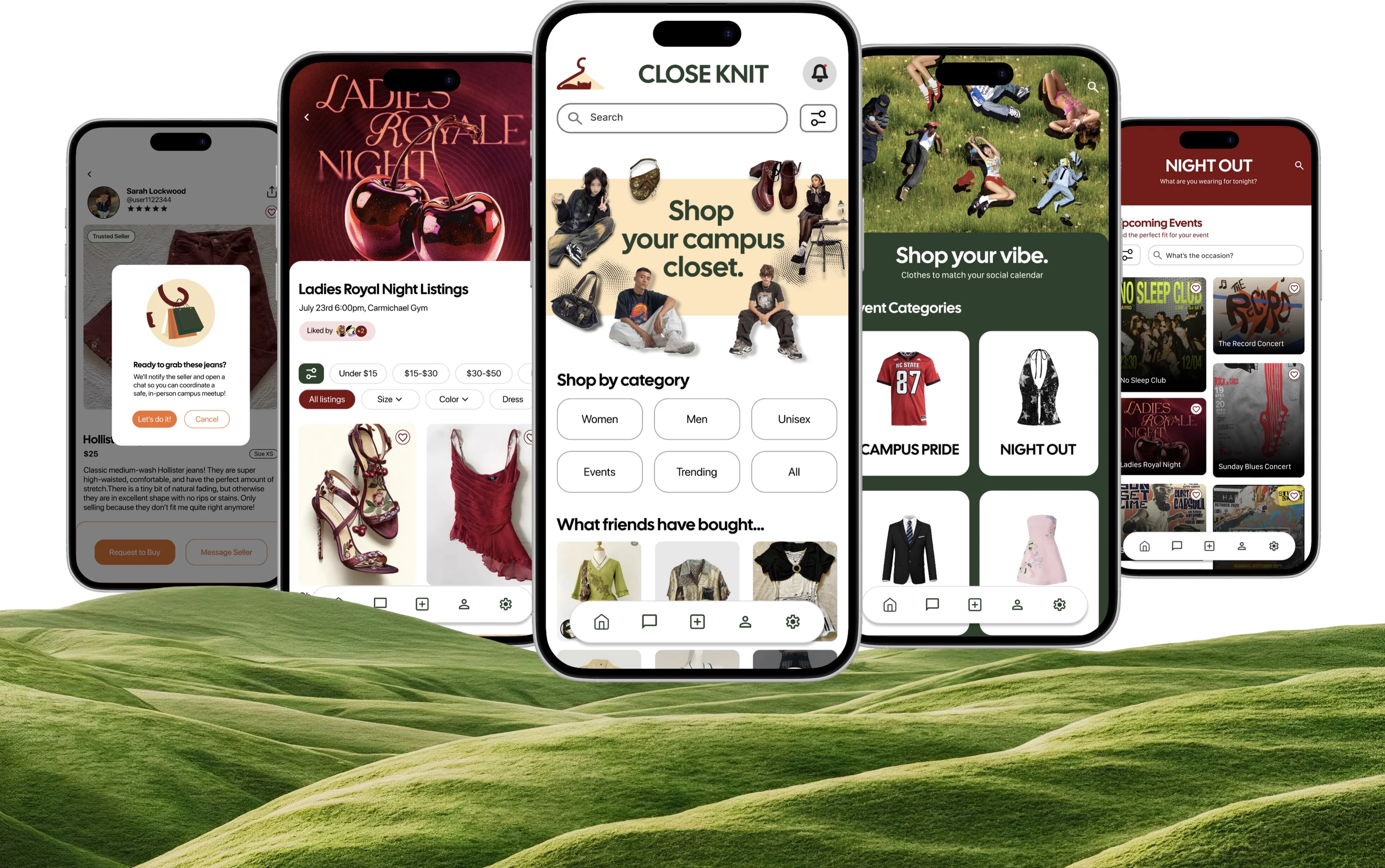
Close Knit
I designed a campus-only marketplace where you actually meet the person. No shipping, no fast fashion cycle.
The Problem
College students buy clothes for one-night events then abandon them. Existing resale apps should solve this, but students worry about scammers, misleading photos, and shipping friction.
The Solution
Close Knit is a campus marketplace where verified students transact face-to-face. You inspect before paying. There is no shipping waste or stranger risk. Close Knit addresses both sustainability and trust.
Final Prototype
Core Transaction Workflows
1. Intent & Request
Browse verified student listings using clear filters. You can pick a convenient on-campus spot, and send a meetup request in one step, bypassing traditional carts and checkouts.
0:000:002. PIN-Protected Exchange
Buyers inspect items in person for fit and condition. Funds stay secure in escrow until the buyer confirms quality and enters the seller’s transaction PIN to release payment.
Buyer’s phone 0:000:00Seller’s phone 0:000:003. Event-Driven Feeds
Shop curated collections for specific campus occasions (game days, formals, mixers). This makes finding event attire effortless while giving single-use outfits a second life.
0:000:00
The Research
I ran a survey with 18 NC State students, weighted heavily toward open-ended questions. I wanted to hear how students talked about their clothes.
The numbers:
- 44.5% of students agree that most of the clothes in their closet go unused.
- 94% were interested in a campus-based clothing app (61% yes, 33% maybe).
If so many students were interested in a campus clothing marketplace, why weren’t they actually selling? The open responses revealed the barriers holding them back.
1. Trust in condition
“Clothing condition isn't what was pictured. Scammers. It's alright but if it's ripped or smelling kinda weird, I'm not buying it.”
Students love thrifting but don’t trust second hand clothes.
2. The effort of selling
“Emotional attachment keeps me from donating. The packaging and shipping effort keeps me from selling.”
Shipping and packaging effort stalls students before they act.
3. The knowing-how gap
“Why I didn’t sell, swap, borrow clothes? Cause I don’t know how.”
Students had never been sellers before. They needed a clear path to get started.
Competitive Audit and User Personas
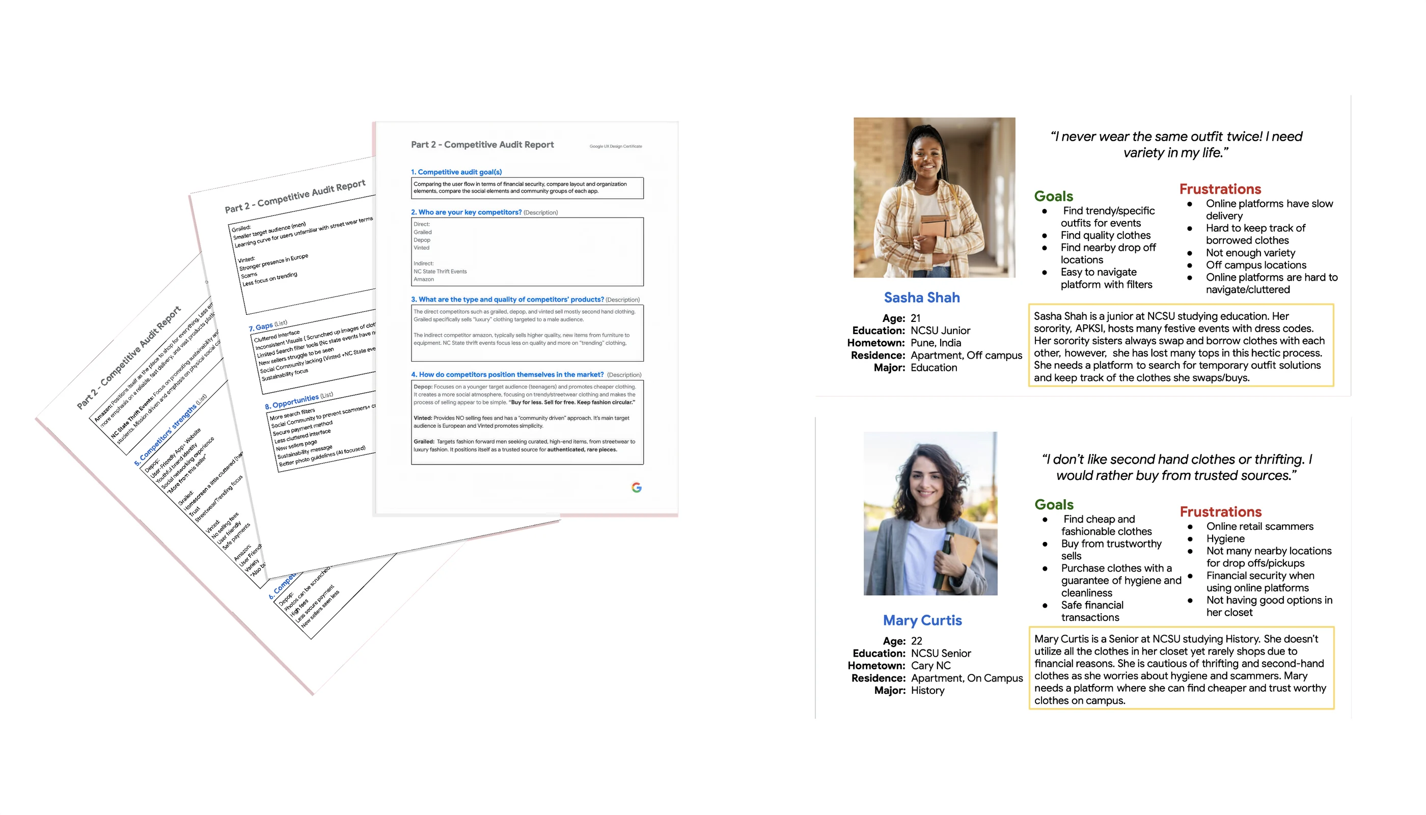
I conducted a competitive audit to see what was missing and then translated it into two user personas.
Findings
Depop has social energy. Vinted removed fees. Grailed built trust through authentication.
On a college campus, you need a sense of trusted community.
- Sasha, 21. Buys for events, frustrated by slow shipping and cluttered apps
- Mary, 22. Worried about quality and hygiene.
Information Architecture
Before designing screens, I mapped the entire system.
Flow 1: Finding and Requesting an Item
Finding & Requesting an Item
I tested two purchase models: the familiar add-to-cart pattern, and a request-based model unique to Close Knit.
The Traditional Approach
The cart pattern implies immediate purchase. Add, checkout, done. But Close Knit requires negotiation. You message the seller, agree on a location, meet in person, inspect, then pay. A cart communicates the opposite and breaks the mental model of the product.
Request-based Model
This approach has two clear paths: Request to Buy (for people ready to purchase) and Message Seller (for questions). Once you request to buy, you can pick a meet up spot with the seller on campus. This approach is similar to apps such as vinted and facebook marketplace.
Usability testing findings
I conducted usability testing to see how to remove any friction
Flow 2: The In-Person Exchange
The Challenge
Two strangers meet on campus. The buyer could take the item and walk away; the seller could take the payment and scam buyers. I had to prevent both.
The Solution: PIN-Based Verification
- The buyer inspects the item for quality.
- Once approved, they ask the seller for the PIN.
- Entering the PIN releases funds into the seller’s account.
One screen
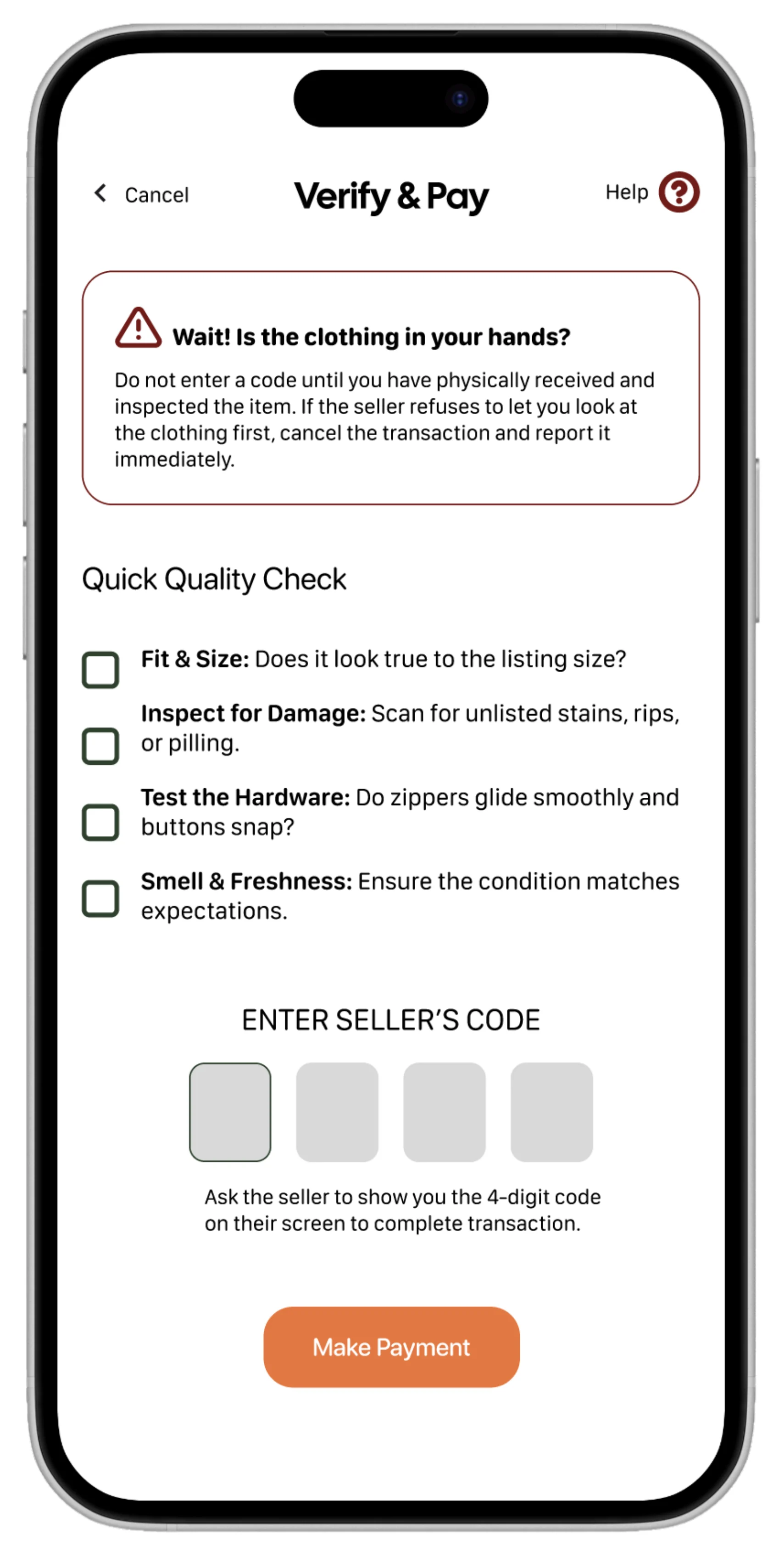
A Quick Quality Check sat above the PIN field: fit, damage, hardware, smell. Testing showed users skimmed it and punched the code on autopilot, not realising the PIN sent money instantly.
The Fix: Progressive Disclosure
I split the flow into three distinct steps. The extra friction is deliberate: when an action is irreversible and involves money and a stranger, the goal isn’t speed. It’s making sure nobody pays for something they haven’t looked at.
Flow 3: Shopping by Event
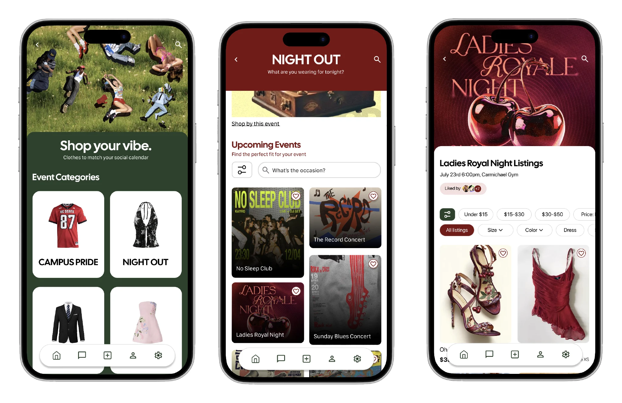
Students’ highest-pressure clothing decisions are event-driven: themed mixers, game days, formals, concerts. Buy something specific, wear it once, never again. This cycle creates so much textile waste.
I designed an events tab where students could shop clothes already worn for specific occasions.
First version vs after usability testing
First version
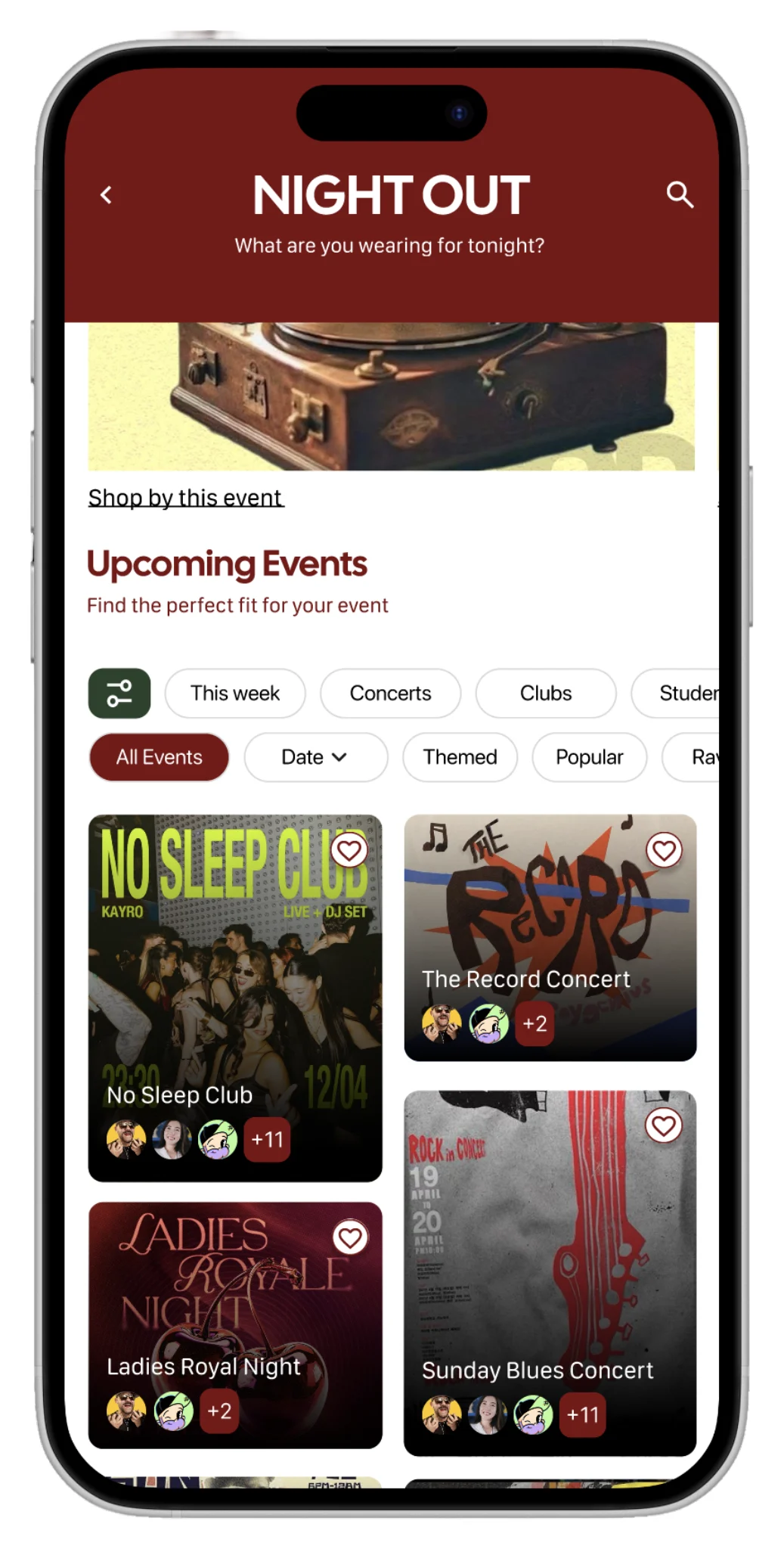
Visual density was fighting readability. Users also didn’t understand the avatars. Filters were redundant.
After usability testing
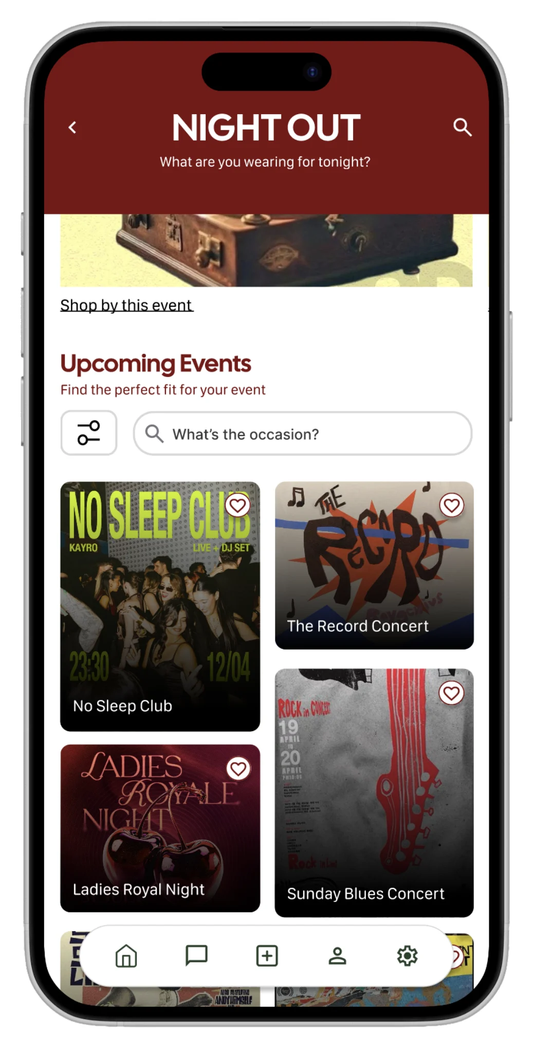
Kept the posters, the highest value element on screen. Moved avatars to the event details screen, and consolidated filters into one master filter icon plus a question-based search: “What’s the occasion?”
Branding
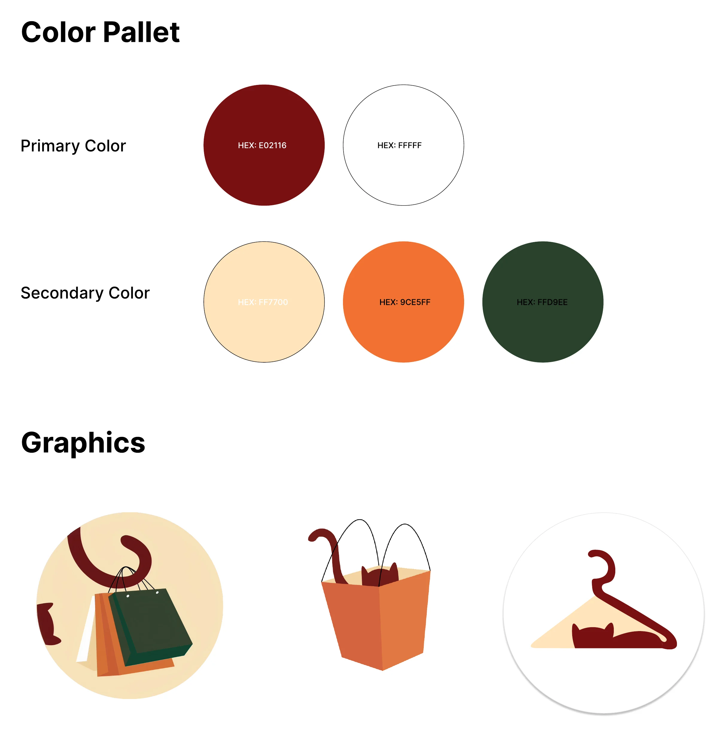
Why a cat?
I sketched my way from Close Knit → yarn → cats, landing on a cat in a hanger: the warmth and approachability students needed when meeting strangers on campus
What This Taught Me
The constraint is the product.
In-person exchange looked like a limitation, no shipping, no instant checkout, no 2am purchases from bed. But that constraint is what makes Close Knit trustworthy and affordable for college students.
Every time I fought it (the cart, the PIN flow, the single-screen payment), I made the product worse. The best decisions came when I stopped fighting the constraint and designed into it.

Keep exploring
ShelterPartner
Redesigned the enrichment logging flow for an animal shelter management platform. Core changes are now live in the product.
Read Full Case StudyNC State QEP Packways
Transforming a dense, 153-program spreadsheet into a clean, filterable digital experience, all within strict brand and timeline constraints.
Read Full Case Study