ShelterPartner
B2B Product
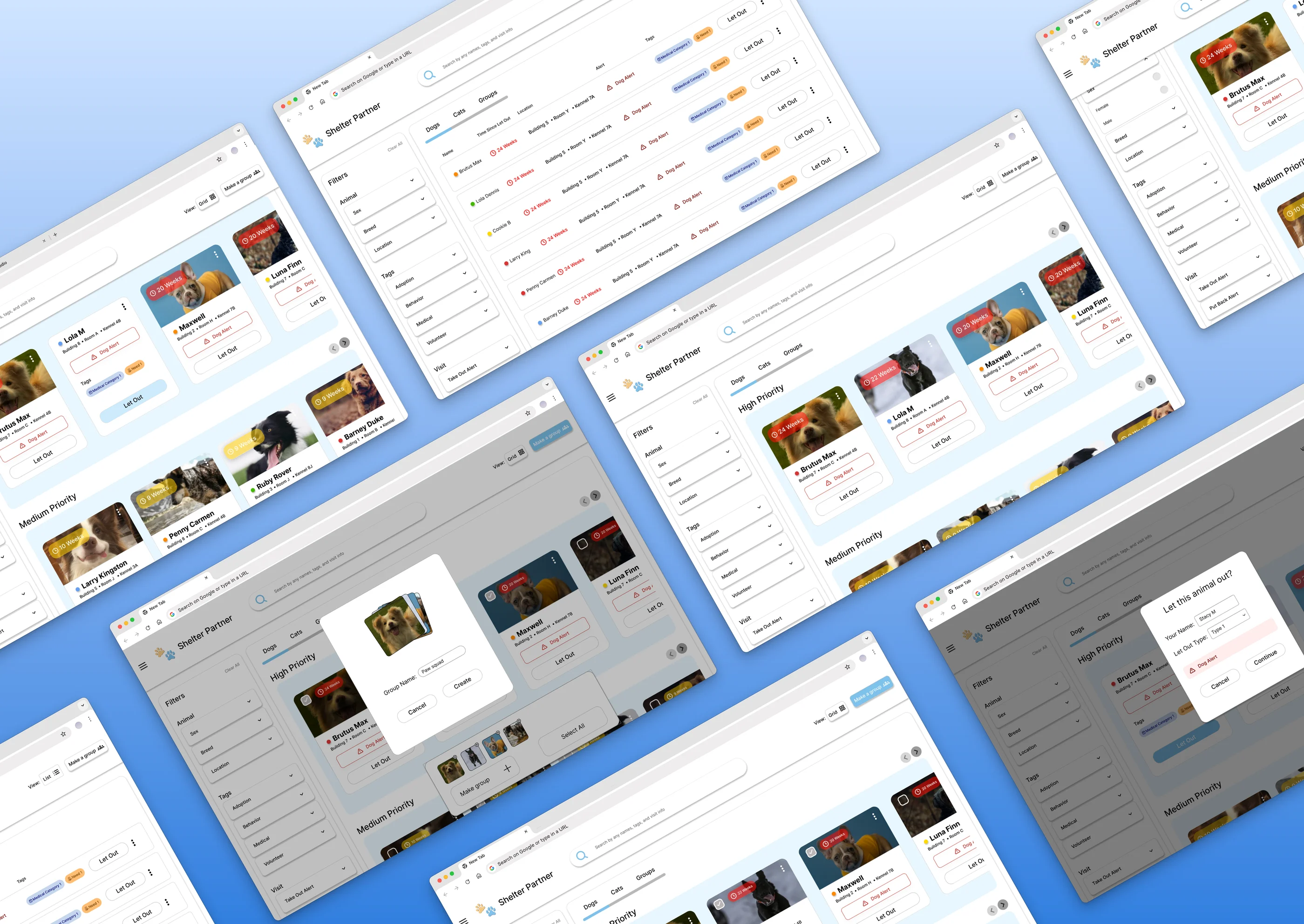
Redesigned the enrichment logging flow for an animal shelter management platform. Core changes are now live in the product.
The Problem
ShelterPartner is a platform that supports shelters, volunteers, and visitors by making it easier to view and manage animals available for adoption. Shelters manage massive datasets with limited time and resources. They use ShelterPartner’s Enrichment tab and struggled to efficiently find animals and record activities due to confusing navigation, unclear search filters, and a card design that buried actionable information under visual noise.
The Solution
The goal of this redesign was to elevate the volunteer experience within the Enrichment tab by improving search functionality, streamlining navigation, and restructuring how animal data is organized. Informed by user feedback, I introduced new, volunteer-requested features to create a more intuitive workflow.
Final Prototype
Clean Intuitive Search Filters
Replaced a flat, overwhelming dropdown with logically grouped filters organized by data type. Removed redundancies (location appeared twice) and eliminated “search by description” fields that volunteers never used. Volunteers can now find any animal in seconds.
0:000:00Prioritizing Card Metadata
Restructured card hierarchy to surface alerts and operational urgency first, moving non-essential tags like Adoption status into an expandable view. Reduced visual noise from 6+ equal-weight pills to a focused, scannable card.
0:000:00Allowing Volunteers to Group Animals
Introduced a grouping feature that lets volunteers select multiple animals at once and perform actions as a unit. Eliminates repetitive individual releases, especially valuable for managing litters or behaviorally linked animals.
0:000:00Reducing Time Spent with “Tap to Let Out” Action
Replaced the laggy hold-to-interact pattern with an instant single tap that triggers clear visual feedback. Removes friction during high-traffic morning shifts where every second matters.
0:000:00
Understanding the Users
I started with two volunteer personas, grounded in real feedback from five respondents across four partner shelters (Nine Lives Foundation, Paws for Life K9 Rescue, Gulf Coast Humane Society, Paws 4Life). Our participants included shelter staff, active volunteers, and board members.
Research: Methodology & Findings
What did volunteers think?
I conducted a cross-shelter survey via Google Forms with 5 respondents across 4 partner shelters. My goal was to identify friction points in the current Enrichment workflow and surface unmet needs the app wasn’t addressing.
The survey was more focused on qualitative data and user feedback/requests across independently-run shelters. The consistency of responses gave strong signal on where to focus.
Volunteer Pain Points
Cluttered Search Filters
“The enrichment Additional options needs some work... when a filter, name search, location search returns results the mobile phone screen is still showing all of the additional options.”
The dropdown was cluttered with items we are not using, and hard to find for searching, specifically for new users.
Unorganized & Redundant Tags
Every animal card displayed 6+ tags at equal visual weight, and one staff member had resorted to a whiteboard to track which animals needed the most socialization each day.
Slow “Let Out” Action
“Simpler tap to let out, maybe less time to hold, or add a focused double tap / vibration to incorporate on different clicks.”
The “tap and hold” interaction for releasing animals was laggy and unintuitive during high-traffic morning shifts, where volunteers expected immediate action.
Inability to Group Animals
“We often have kittens sharing a single cage. It would be useful to automatically start a visit for all the kittens that share a cage.”
Shelters often house multiple animals in a single space, but the current design forced volunteers to select and release each animal one at a time.
I made four surgical improvements targeting the specific friction points volunteers identified while keeping the experience intuitive for long time volunteers.
Redesigning the Search Filters
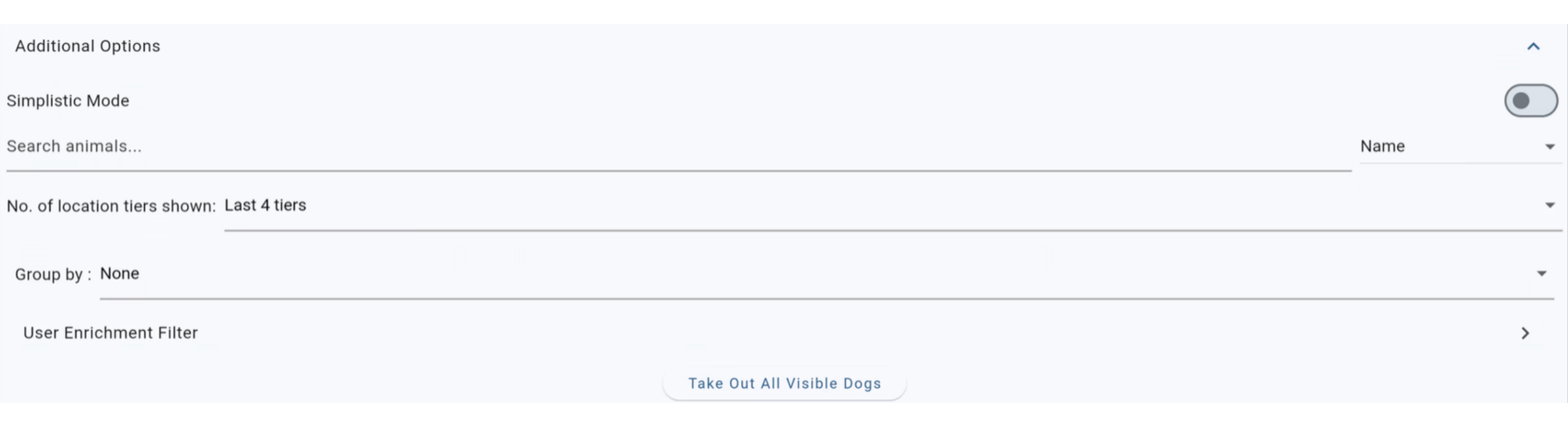
Volunteers mentioned getting lost in options and spending time hunting for the right filter instead of finding the animal they needed.
Exploration
I conducted competitive research across modern platforms: Airbnb, Vrbo, Amazon, Notion, Airtable, and Petfinder, to see how established products organize complex data. Most shelter websites were outdated and visually chaotic, so I stuck with cleaner, modern patterns.
I explored two distinct approaches: a segmented search bar (inspired by Airbnb’s progressive disclosure) and a dropdown menu navigation panel (inspired by Amazon and Petfinder). Both had merit, but they served different user priorities.
Segmented Search Bar
Dropdown Menu
The Decision
I went with the dropdown menu. The segmented bar was dynamic and visually elegant, but it asked more of the volunteer:
- They had to understand a conceptual model, “Animal” vs. “Tags” vs. “Visit,” before they could search.
- That mental overhead, however small, didn’t match the “intuitive and reliable” system shelter workers needed.
The dropdown was immediately intuitive at a glance, already familiar, and let volunteers search any word in a free-text box, a low-friction interaction they’d use in seconds.
What Changed
I reorganized the filters into logical groups instead of a flat list, removing redundancies. Location, which appeared under both “General” and “Tags,” moved to the “Animal” section where it belongs. The “search by description” field was removed as volunteers don’t remember specific written descriptions; they remember the tags staff used to label animals. Removing that reduced clutter without losing functionality.
Redesigning the Animal Card
Why It Mattered
The animal card is the main unit of the Enrichment experience. Every interaction starts here: volunteers scan the grid to find which animal to let out, check for alerts, and note how long it’s been since the last visit. A poorly prioritized card makes every task slower.
Card Hierarchy Metadata
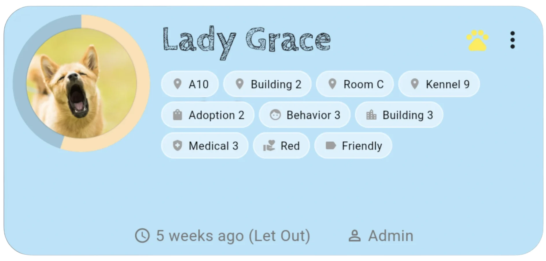
Tag overload was the #1 issue. With 6+ pills on every card in equal visual weight, nothing stood out. I reviewed competitive products to understand how others handle metadata-heavy information. The key insight was to prioritize data and demote non-urgent info.
I reorganized the card information in order of what a volunteer needs to know in the moment and created a design system for the card content.
Secondary Details & Expanded View
Adoption and Volunteer tags don’t drive immediate action, so I moved them into an expandable view. When volunteers need more context, they can tap (or hover on desktop) to see the full tag list. This keeps the primary card focused on “what do I need to know to safely interact with this animal right now?”
I also simplified behavior tags into a single circle icon, cutting visual overload immediately.
Before
After
Adding Grouping
Why It Mattered
Shelters don’t manage animals in isolation. Kittens share a cage. Multiple dogs might need to go out together for behavioral or medical reasons. The current design forced volunteers to select and release each animal one at a time.
The Design Iteration
I introduced a grouping feature that lets volunteers select multiple animals at once and perform actions on them as a unit. My original “grouping” action was unintuitive and hard for users to understand. So I researched grouping interaction models.
For my second round of iteration, I referenced Google Photos’ grouping pattern, as it is familiar to most users, efficient, and easy to understand. When they tap “Make a Group,” they can select animals, see their selections at the bottom of the screen, and the group is saved for future shifts.
First attempt
Familiar multi-select pattern
Streamlining “Let Out”
Why It Mattered
The original “tap and hold” design created friction during high-traffic shifts. Volunteers expected immediate action; they got lag and uncertainty. Every second compounds when you’re managing 20+ animals in a morning rush.
The Redesign
I replaced the hold interaction with a single tap “Let Out” button that instantly triggers the action, paired with clear visual feedback (haptic, color change, confirmation). The interaction is now instant and reliable which is exactly what the workflow demands.
Before: tap and hold
After: single tap
The Outcome
By focusing on four targeted improvements: search clarity, card hierarchy, grouping, and action speed, I reduced the friction points that made daily workflows harder. The result is a more intuitive, faster, and more reliable experience for the volunteers who power shelter operations.
This project is ongoing. The remaining tabs (Volunteers, Visitors, Settings) are next.
What I Would Do Differently
Next phase, I’d explore AI-powered search that can learn from volunteer behavior and tagging patterns to surface the right animals faster. Instead of relying purely on manual filters, predictive search could suggest animals based on historical interactions, volunteer preferences, and real-time enrichment needs which would turn the search bar into a smarter, more efficient tracking tool for high-priority animals.
Keep exploring
Close Knit
I designed a campus-only marketplace where you actually meet the person. No shipping, no fast fashion cycle.
Read Full Case StudyNC State QEP Packways
Transforming a dense, 153-program spreadsheet into a clean, filterable digital experience, all within strict brand and timeline constraints.
Read Full Case Study