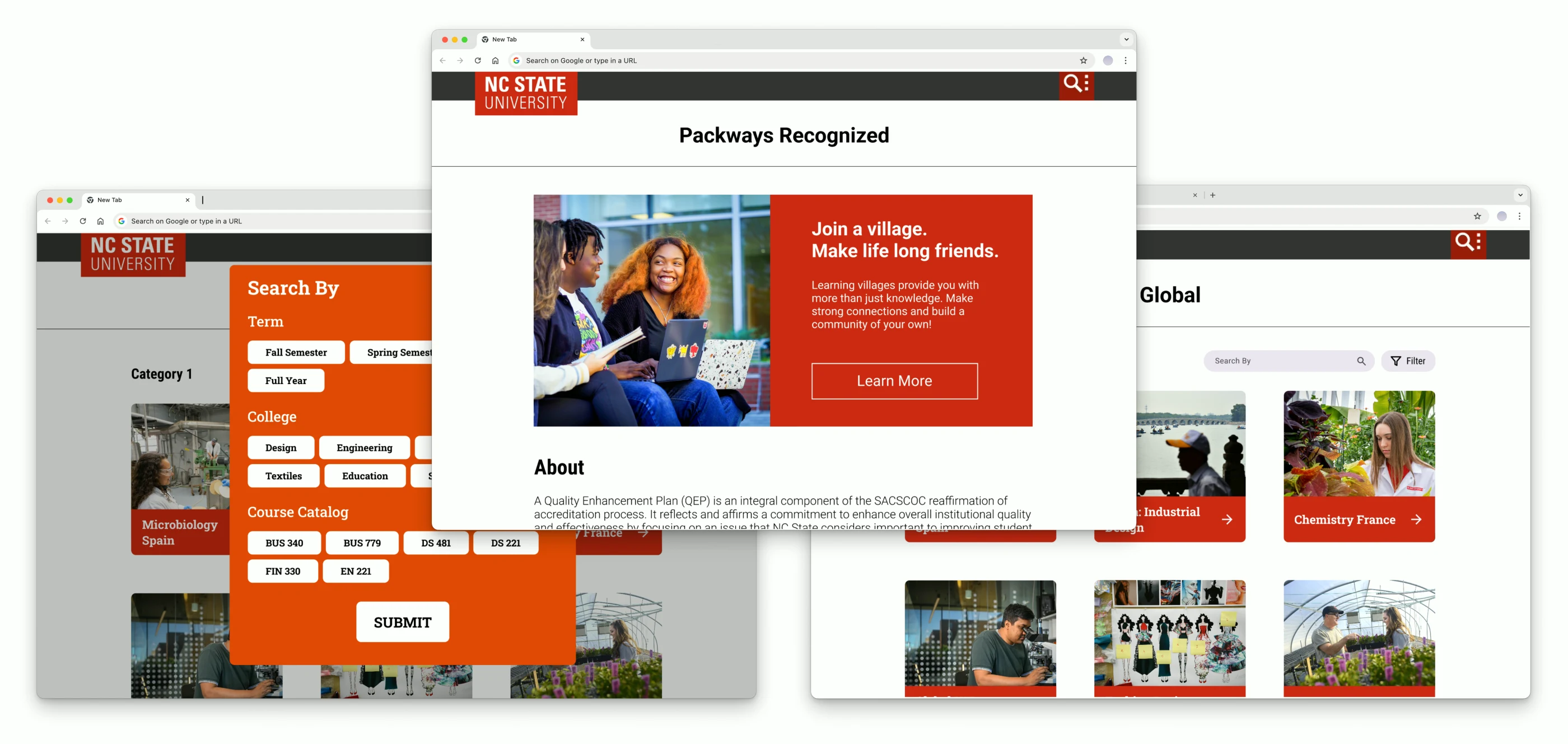
NC State QEP Packways
Website Redesign Internship
I transformed a dense, 153-program spreadsheet into a clean, filterable digital experience, all within strict brand and timeline constraints.
The Challenge
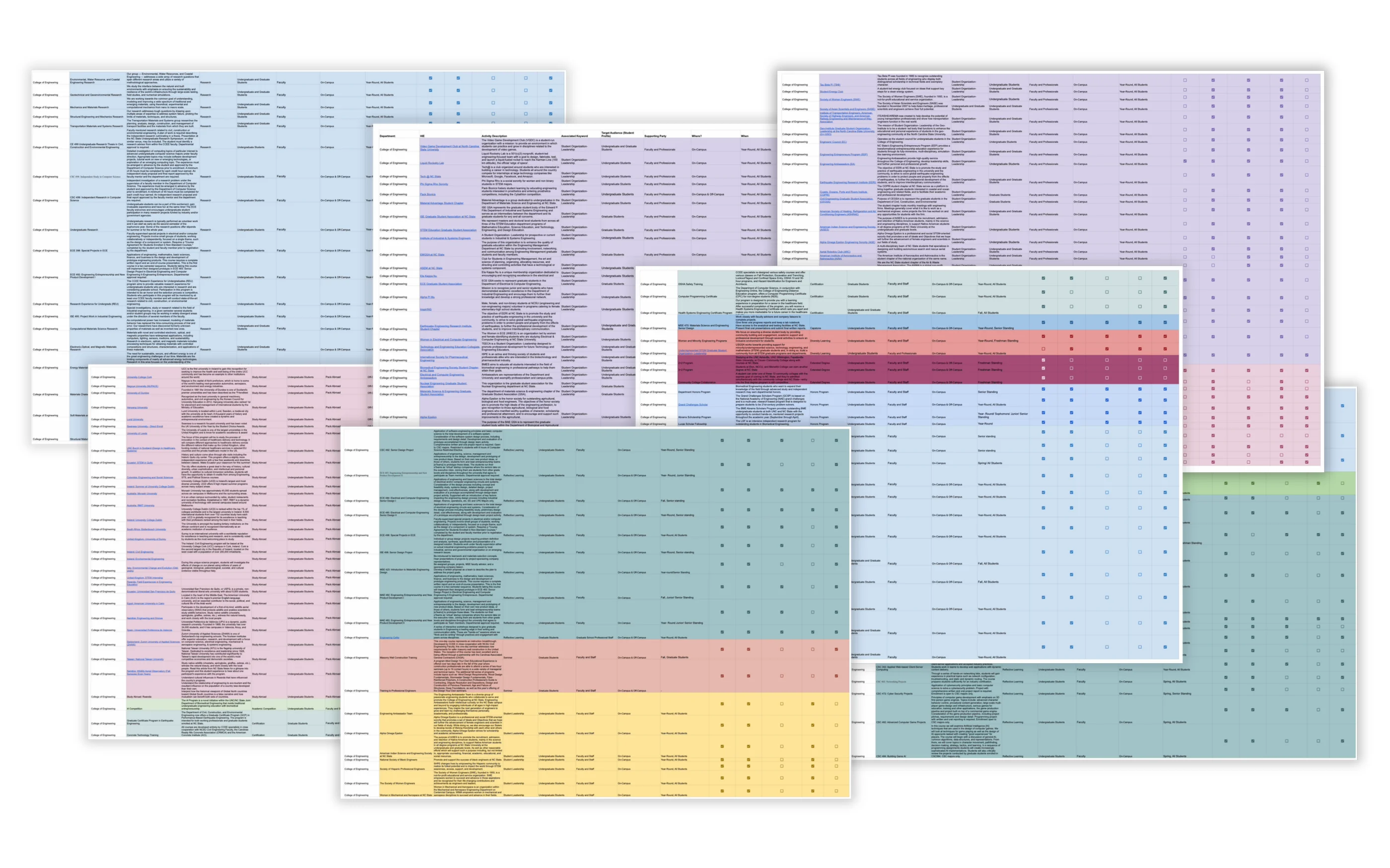
NC State’s QEP Packways initiative connects students with high-impact educational experiences across campus. But the program information lived in a Google spreadsheet: 153 programs, 8 pages of dense text, organized by campus unit instead of by what students actually needed. Students had a hard time scanning, comparing, or discovering the right program for them.
The Constraints
I was working within three strict requirements:
- Spotlight carousel on the hero to feature some programs/opportunities.
- NC State brand consistency that felt institutional and accessible.
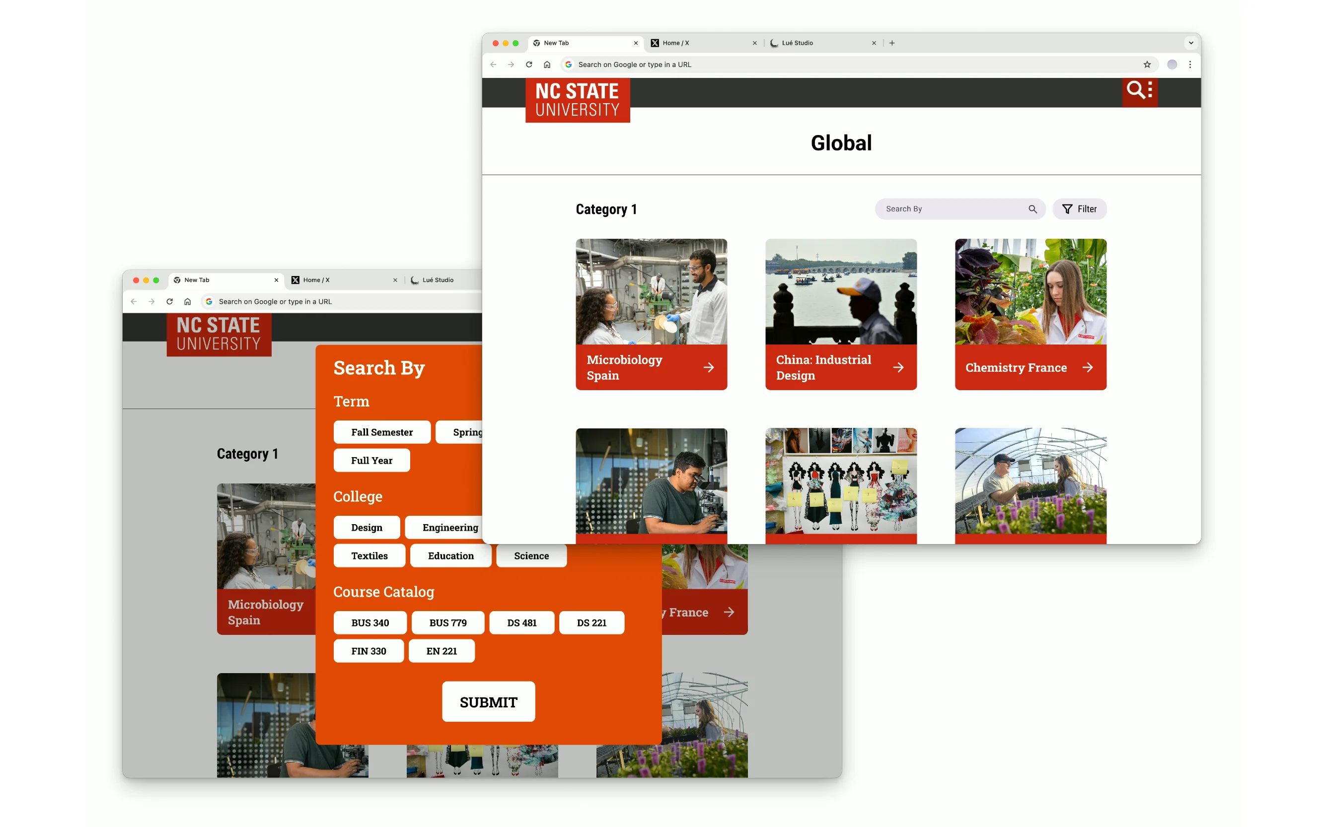
- Clear search and filter structure so students could navigate by terms, courses, or departments.
With a fixed brief and only one month to build, every decision had to serve the client’s requirements first.
Final Prototype
The Approach
AI Assisted Data Organization
The spreadsheet had everything I needed, but in the wrong structure. I used Claude to organize 153 programs and identify patterns: which programs belonged together, what attributes mattered for student decision-making, and where the data had gaps, which helped surface 5 distinct HIE categories.
Manual categorization would have taken 8 to 10 hours of the timeline. Delegating the sorting to AI let me spend that time on the parts of the project that required design judgment: the navigation model, the card hierarchy, and the brand system.
Studying NC State’s visual language
Every choice, such as color or type, came straight from NC State’s brand guidelines. Wolfpack Red anchors the page and carries the hierarchy, with Roboto as the primary typeface. The design is built on NC State’s approved color pairings, which meet WCAG AA, the accessibility standard the university holds its own sites to.
I wanted Packways to feel like another branch of the NC State website, so a student landing on it would never question whether they were still on a university platform.
How I Met the Client’s Needs
Spotlight carousel Featured programs on the hero section, for showcasing specific programs.
Clear filters and search Five HIE categories from the AI-organized IA, making discovery intuitive instead of overwhelming for students.
Brand consistency Color and typography choices that respected NC State’s identity while feeling built for students.
Outcome
Packways went from a spreadsheet no student would read to a structure any student could navigate. The QEP team came away with a working prototype and a system that scales past the 153 programs it started with.
What I Learned
The spreadsheet was made for administrators. Learning to design for students meant asking what they’d actually be looking for, then rebuilding the structure around that instead of around who ran which program.
I also spent real time in NC State’s guidelines, understanding why red predominates and what Roboto Slab is reserved for. Knowing which inherited thing to keep and which to rebuild was the whole project.
Keep exploring
Close Knit
I designed a campus-only marketplace where you actually meet the person. No shipping, no fast fashion cycle.
Read Full Case Study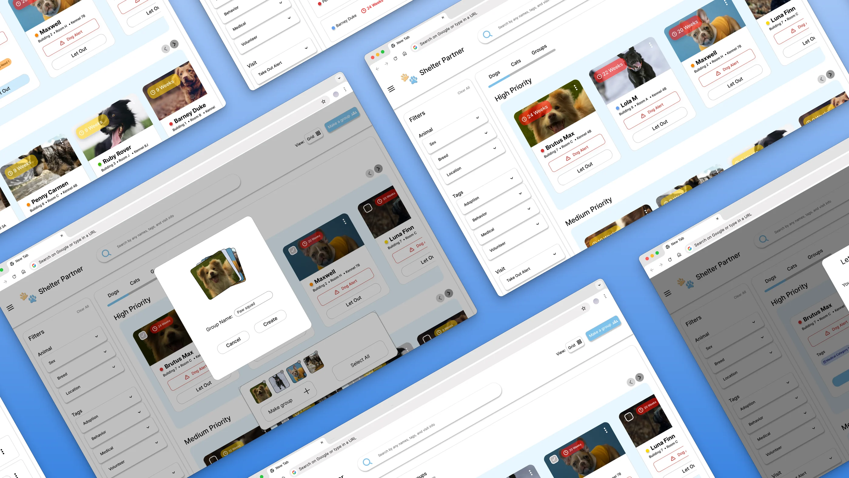
ShelterPartner
Redesigned the enrichment logging flow for an animal shelter management platform. Core changes are now live in the product.
Read Full Case Study